OLIN Ski Product Line
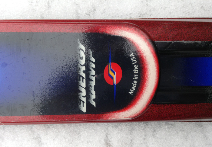
In 1999, OLIN Skis, part of K2's Team Sport brand, marked its 28th year in the industry with an exciting new consumer and trade campaign that achieved remarkable success. I had the privilege of creating consumer graphics for their fresh product line that year, which prominently featured the APEX-T, the flagship model of OLIN's Breakthrough Series. Distinguished by its innovative design with a deep cut, the Apex-T boasted a new Veratec Kevlar wrap, ACX tuning, and a cutting-edge Piezo-Electric dampener, all of which contributed to its exceptional performance and appeal.


The Process
If you've ever perused ski brochures, you've likely encountered phrases like 'world-class,' 'industry-leading,' or 'unsurpassed technology.' To maintain both accountability and productivity, Ski, a division of K2, consistently submitted their new skis for SKI Magazine's rigorous ski tests. Remarkably, year after year, these skis consistently earned prestigious gold awards. The pinnacle of their recognition came in 1999 when they secured two coveted 'Editors Choice' awards from SKIING Magazine.
This success underscored the critical importance of having cutting-edge graphics on the skis. Steve Higgins, the Global Product Manager for K2's ski division at the time, entrusted me with the task of creating an entirely new line of ski graphics for the 1999 season. The weight of this responsibility was not lost on me. With four years of experience at K2, my prior graphic design work had encompassed skateboarding, snowboard design, and logo creation for the tech line. However, designing for skis presented a unique challenge, primarily due to the distinct shape of the design area.
After numerous iterations and a steadfast commitment, these are my best designs for Ski's 1999 line of men's and women's skis, a project that was both a milestone in my career and a testament to the brand's commitment to excellence.
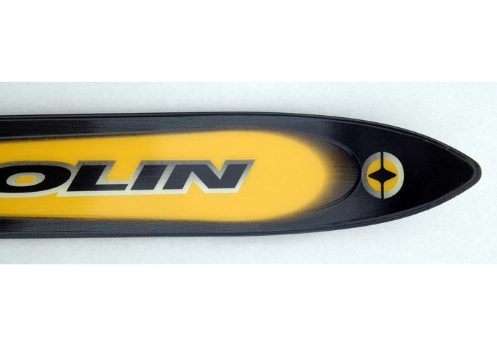
Designing for skis presents a unique set of challenges, as precision is paramount to ensure that the graphics align perfectly across various sizes, avoiding interference with bindings or boots. The prior year's ski line featured intricate patterns and shapes, prompting me to pivot towards a cleaner, more abstract aesthetic. I envisioned a design that would be both vibrant and simple, harmonizing beautifully against the brilliant white backdrop of the slopes. My approach hinged on using the ski's inherent structure, lines, and width as a foundational framework.
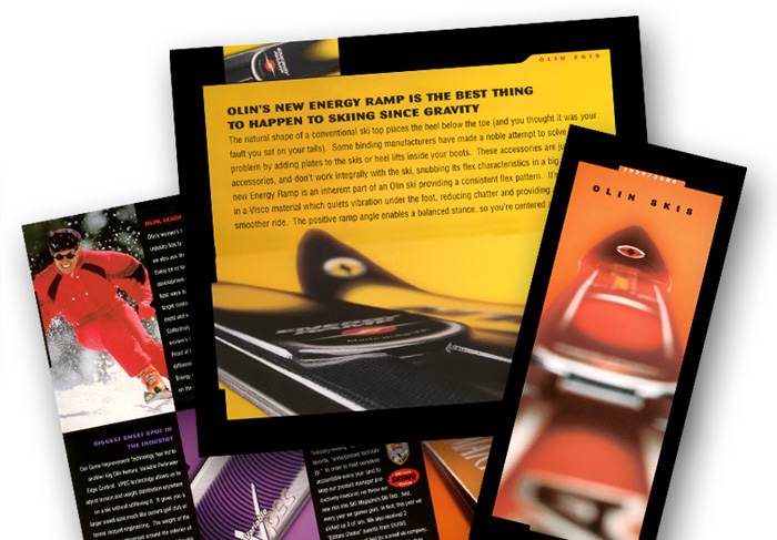
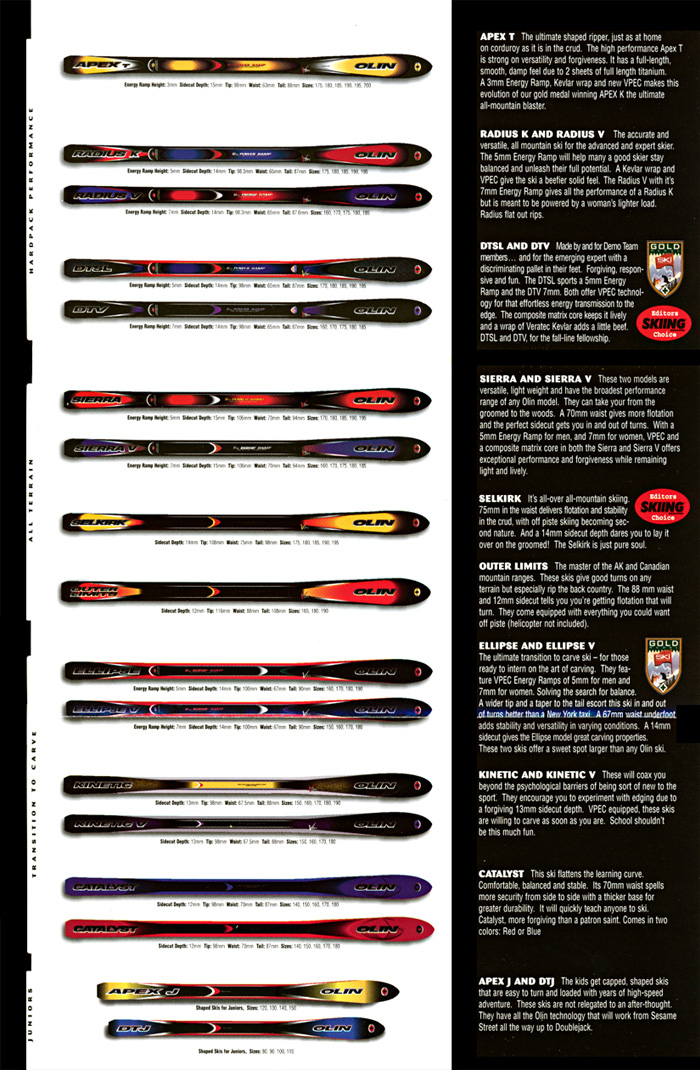
With this vision in mind, I aimed to imbue the iconic ski and the 'bug' logo with a sleek, less three-dimensional appearance compared to the previous year, evoking a sense of speed and agility. One advantage of working at K2 was that the production staff was situated within the same facility on Vashon Island, allowing me to closely oversee the entire ski production process, from inception to completion. Through iterative design and production refinements, the final results were remarkably successful. I crafted a total of 17 distinct ski graphics that year, spanning men's, women's, and junior skis, all of which went into production. The artwork I created for the skis also found its way onto ski poles and clothing. Witnessing the first set of skis I designed displayed proudly at the trade show in Las Vegas, as well as in brochures and marketing materials, was a gratifying personal milestone. Seeing them out on the slopes, with enthusiasts enjoying my designs, added an extra layer of fulfillment to the entire experience.
With this vision in mind, I aimed to imbue the iconic ski and the 'bug' logo with a sleek, less three-dimensional appearance compared to the previous year, evoking a sense of speed and agility. One advantage of working at K2 was that the production staff was situated within the same facility on Vashon Island, allowing me to closely oversee the entire ski production process, from inception to completion. Through iterative design and production refinements, the final results were remarkably successful. I crafted a total of 17 distinct ski graphics that year, spanning men's, women's, and junior skis, all of which went into production. The artwork I created for the skis also found its way onto ski poles and clothing. Witnessing the first set of skis I designed displayed proudly at the trade show in Las Vegas, as well as in brochures and marketing materials, was a gratifying personal milestone. Seeing them out on the slopes, with enthusiasts enjoying my designs, added an extra layer of fulfillment to the entire experience.